

SimpleHouse
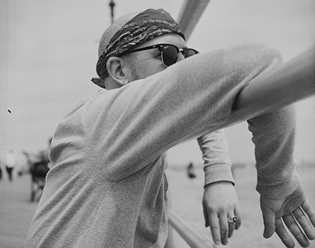
I was asked to develop a brand for a new community music and cultural venture based in Houston, Texas. The SimpleHouse team had a few key ideas in mind - incorporating a house into the logo and including a nod to a tree. This symbol of growth felt fitting for a business with ambitions to scale and expand its capabilities - the branching leaves or limbs representing new opportunities.
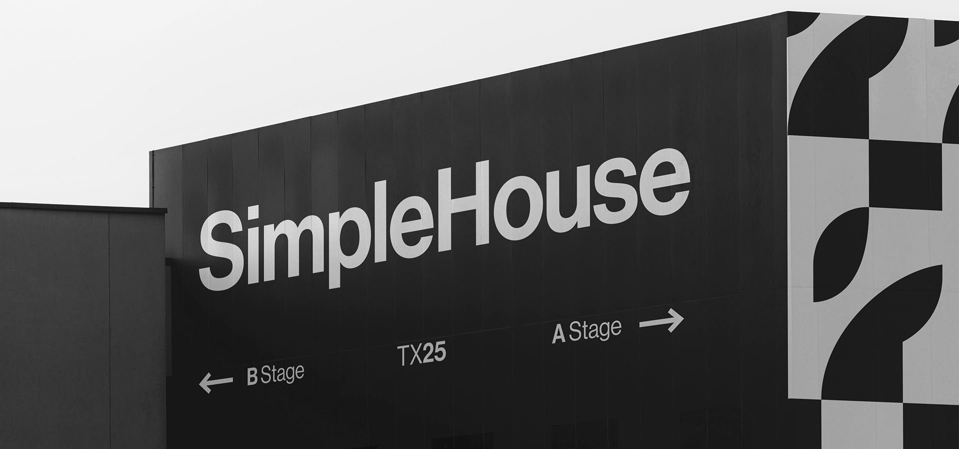
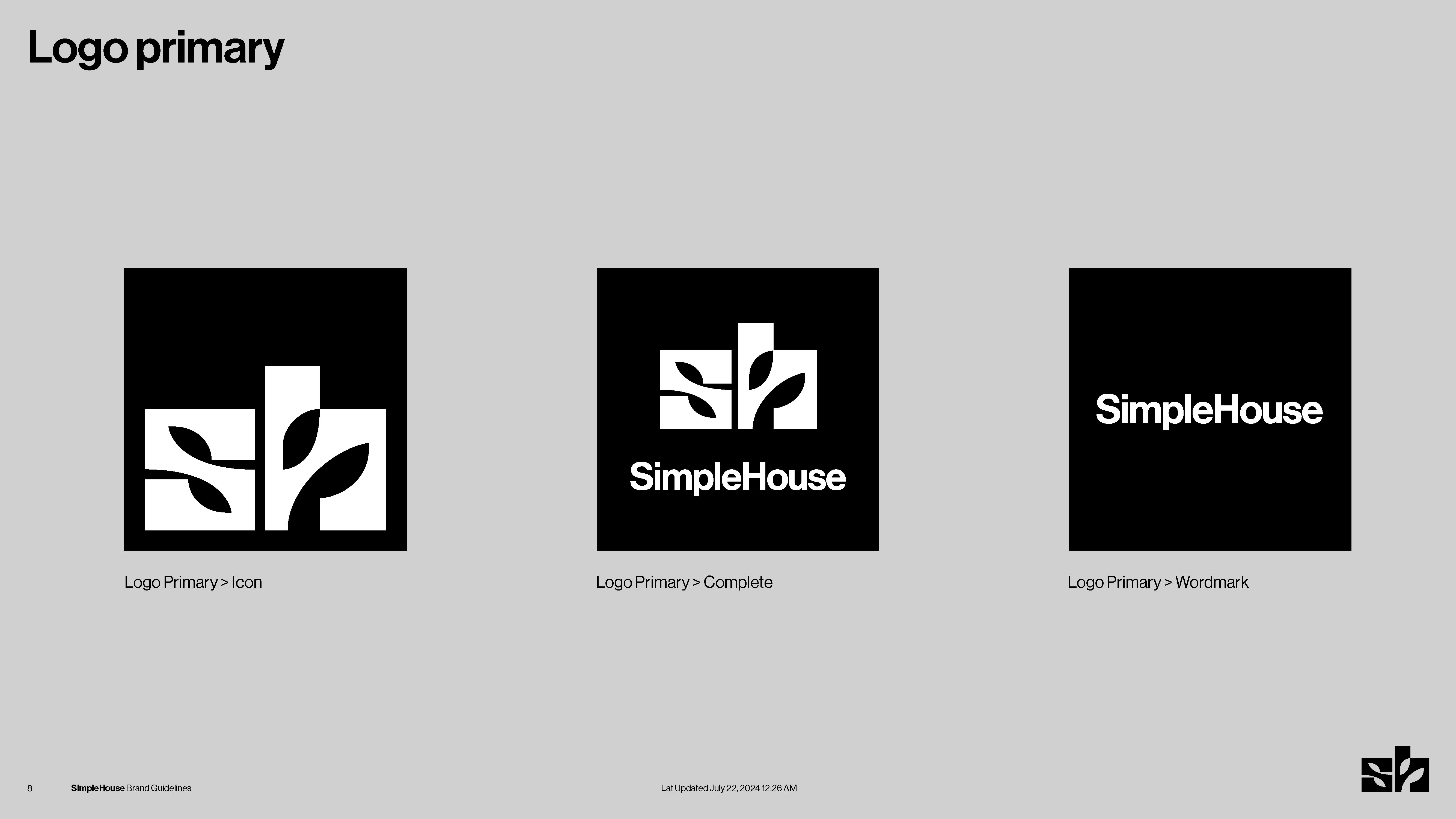
We explored around 100 logo concepts before the team gravitated toward the “SH” - a simple house shape with a chimney, punctuated by cut-out leaves. The result was a sharp, minimal mark that felt strong and memorable.
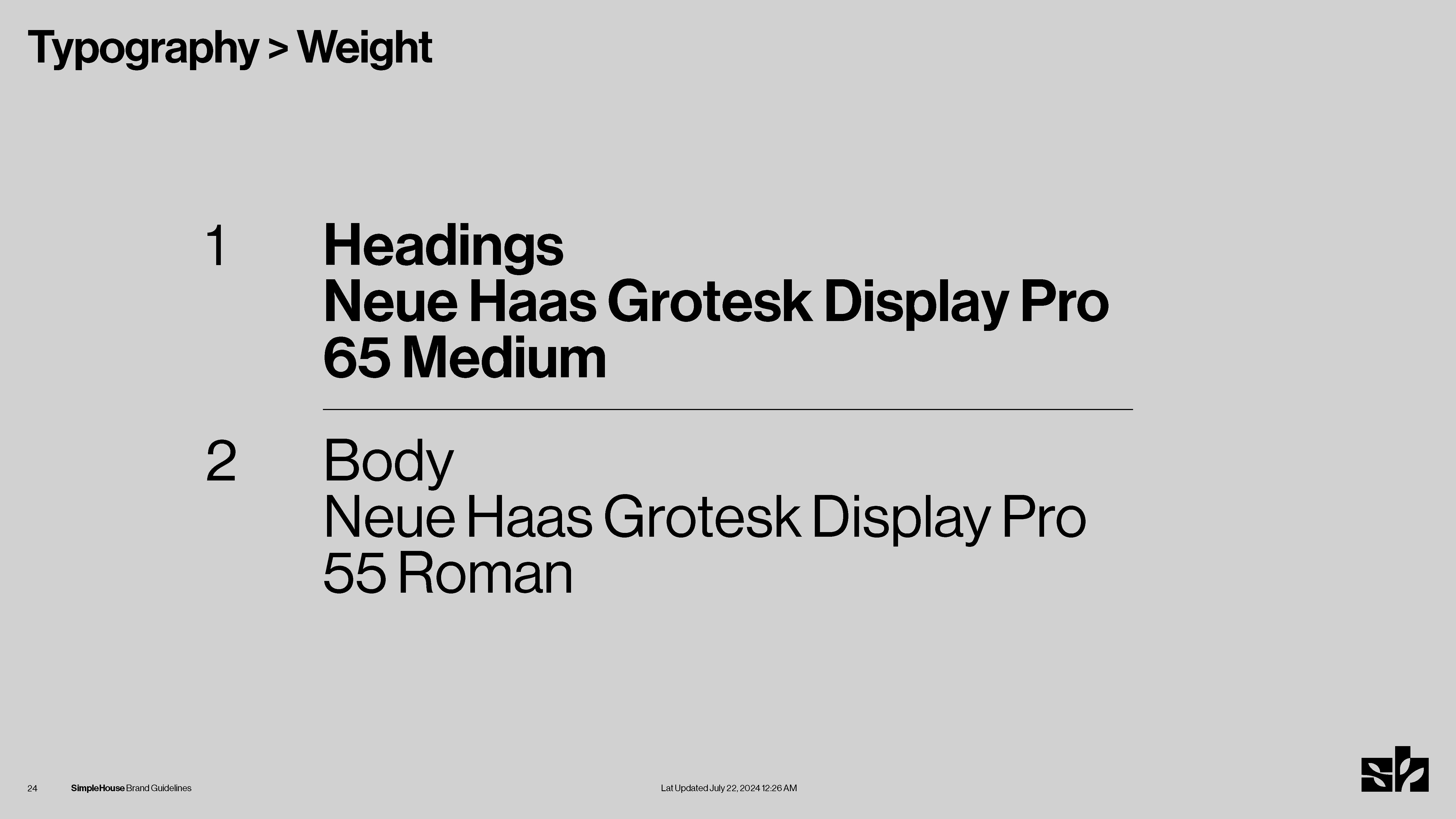
Knowing this was a new brand with a wide range of potential outputs, I built a clean but comprehensive set of brand guidelines. These included patterns, multiple secondary logos, image treatments, color palettes, and layout direction. I aimed to strike a balance - providing useful tools and structure without overwhelming or overcomplicating the brand. Flexibility was essential. At the end of each section, I suggested potential growth and development paths to ensure the brand could evolve alongside the business giving them open ended guidence to cover them as they move forward.
I look forward to seeing how the brand develops.
I was asked to develop a brand for a new community music and cultural venture based in Houston, Texas. The SimpleHouse team had a few key ideas in mind - incorporating a house into the logo and including a nod to a tree. This symbol of growth felt fitting for a business with ambitions to scale and expand its capabilities - the branching leaves or limbs representing new opportunities.
We explored around 100 logo concepts before the team gravitated toward the “SH” - a simple house shape with a chimney, punctuated by cut-out leaves. The result was a sharp, minimal mark that felt strong and memorable.
Knowing this was a new brand with a wide range of potential outputs, I built a clean but comprehensive set of brand guidelines. These included patterns, multiple secondary logos, image treatments, color palettes, and layout direction. I aimed to strike a balance - providing useful tools and structure without overwhelming or overcomplicating the brand. Flexibility was essential. At the end of each section, I suggested potential growth and development paths to ensure the brand could evolve alongside the business giving them open ended guidence to cover them as they move forward.
I look forward to seeing how the brand develops.