

Giveon
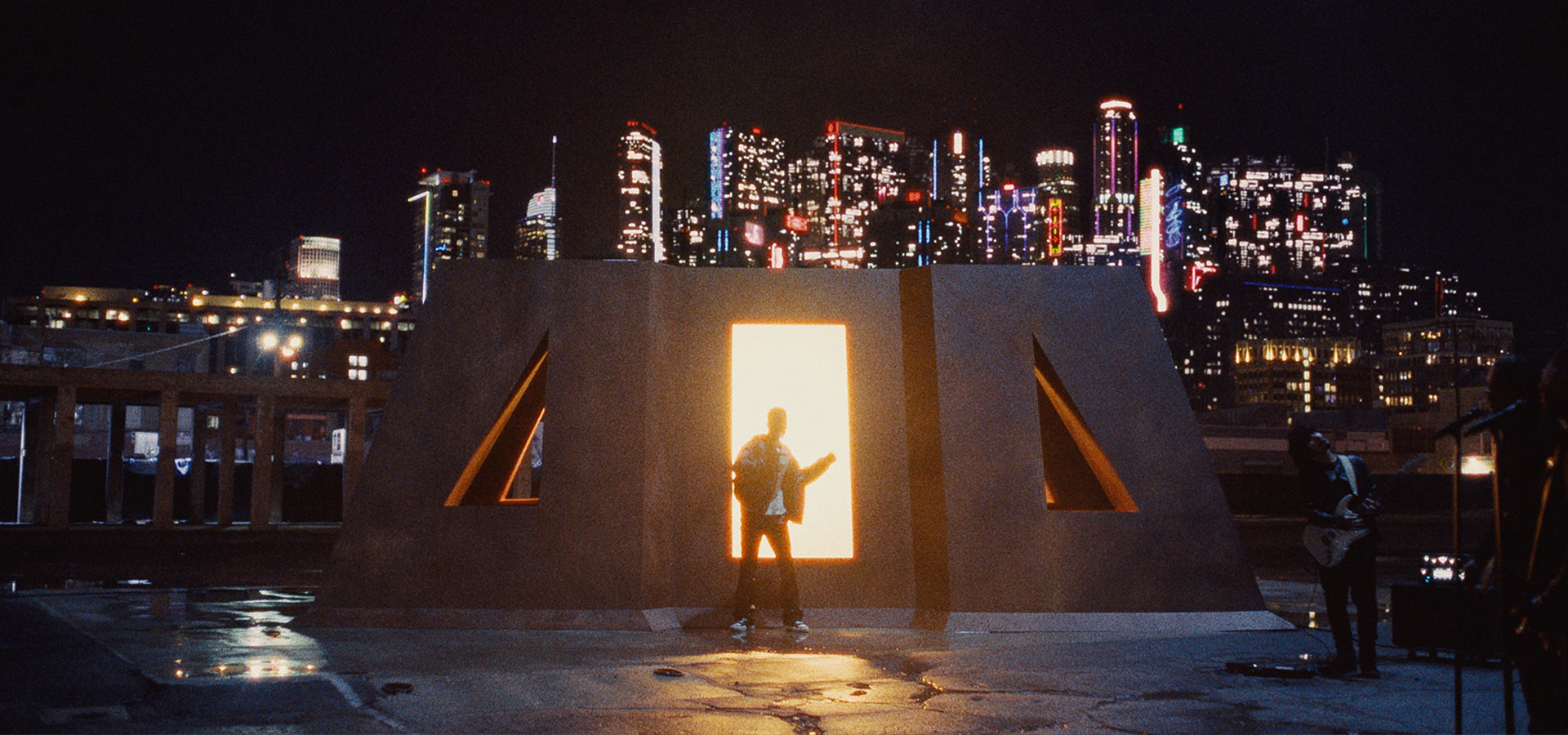
Hugely ambitious project to replace background signage and add additional elements to the Los Angeles skyline, elevating three live performances and a short film.
The director had a grand vision to add some additional spectacle to the piece with some background augmentation, never one to shy away from a challenge I agreed. Building out some tests in pre-production to set ourselves up for success with some barriers and limits giving us a check list for the shoot.
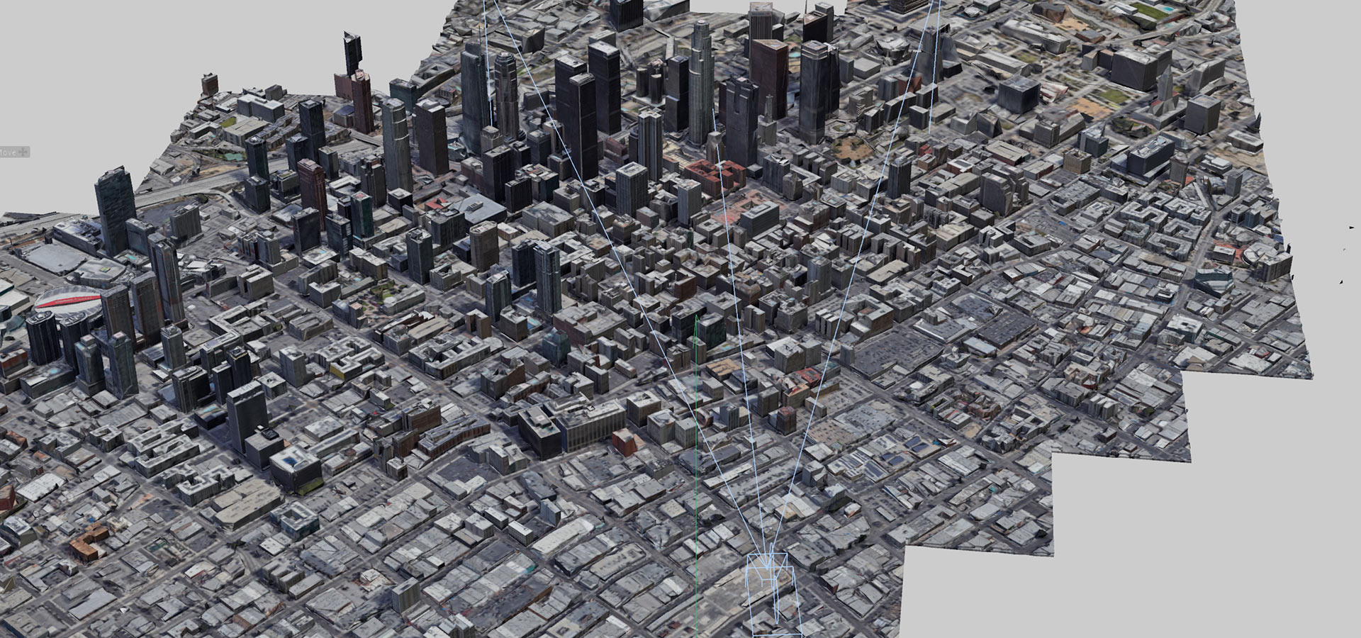
Post shoot - The initial step was to extract a 3D version of the city from Google Maps and sync it with the camera position and focal length. From there, I carefully placed new buildings to integrate seamlessly with the real Los Angeles skyline—avoiding the most recognizable structures while using them as helpful tracking markers.The aesthetic drew inspiration from a blend of Blade Runner, Hong Kong, and early 20th-century U.S. cities. The architecture feels rooted in the Depression era lower down but as the buildings rise higher they feel like we move through the present into a not too distant future. I built some buildings myself, purchased others, and kit-bashed greebles and various elements to quickly add futuristic geometry. We incorporated designs based on the artist’s star signs and song lyrics, which we translated into neon details to dress the buildings.
The pieces are shot as one takes on a steady, the original plan was to use a full 3D camera track, but as the project progressed, fog and grain interfered, making accurate tracking difficult and prone to unreconcilable drifts and jumps. Working alongside the Senior Editor, we ended up 2D tracking - often manually - the entire piece, removing the background before compositing in the new city and replacing the cut buildings. It was a huge challenge, and with a slightly compromised tracking setup plus a myriad of technical issues, we pushed through late nights powered by a blend of coffee and a naive determination.
Additional touches included covering an infamous giant downtown LA neon sign with a design referencing the artist, and fulfilling the director’s dream to have the opening shot of the sky focus on the moon - ironically the easiest element to create, but the hardest to track.
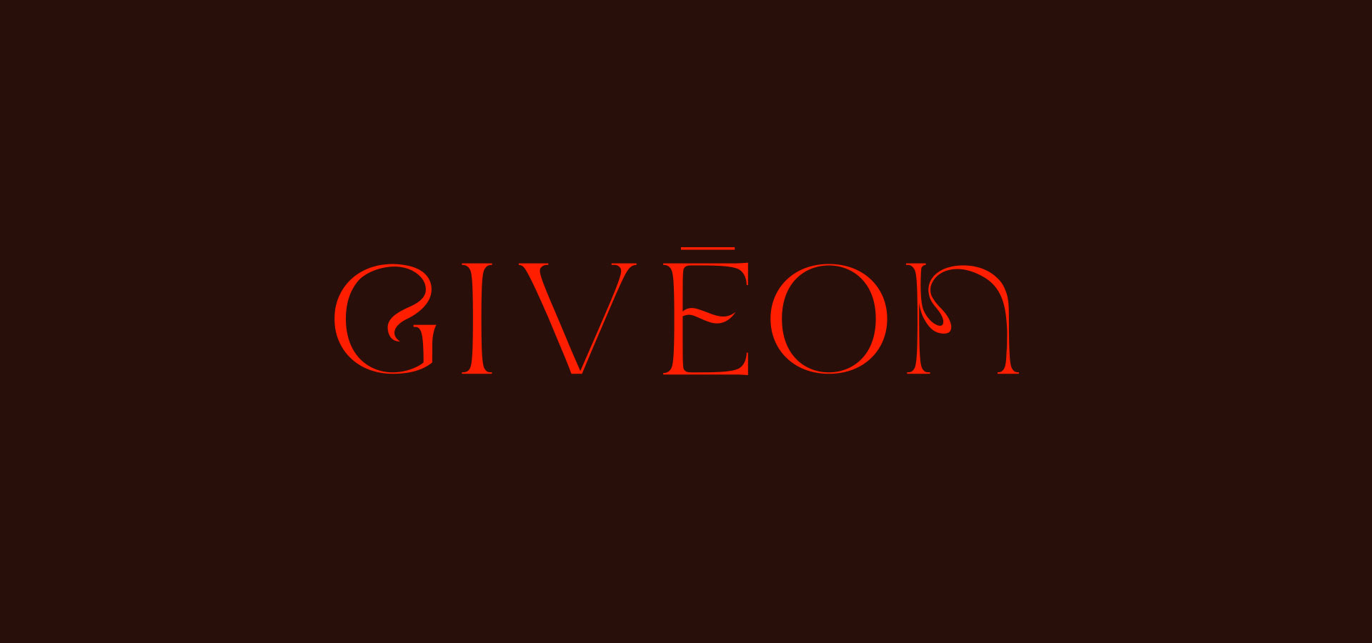
Finally, I built a custom hero typeface that was sensitive to both the artist and the world we created - delicate, clean, and evocative of the older, crumbling Art Deco environment surrounding it.


